What Is Aspect Ratio? Every Common Ratio Explained
Aspect ratio is the proportion between an image's width and its height — written as two numbers separated by a colon, like 16:9, which means "16 units wide for every 9 units tall." It says nothing about size: a phone screen and a stadium jumbotron can share the same aspect ratio. It's pure shape. And that shape quietly decides more than almost any other spec — whether a movie fills your screen or floats between black bars, whether a game shows you more world or less, whether two documents fit side by side.
Here's every ratio you'll actually meet, what it's for, and the two-minute math to work out any ratio yourself.
Every Common Aspect Ratio at a Glance
| Ratio | Decimal | Where you'll see it | Example resolutions |
|---|---|---|---|
| 1:1 | 1.00 | Square — classic Instagram posts, album art, profile pictures | 1080×1080 |
| 4:3 | 1.33 | Old TVs and monitors, iPads, retro games | 1024×768, 1600×1200, 2048×1536 |
| 3:2 | 1.50 | 35mm photography, Microsoft Surface, many laptops | 3000×2000, 2160×1440 |
| 16:10 | 1.60 | MacBooks, productivity laptops | 1920×1200, 2560×1600 |
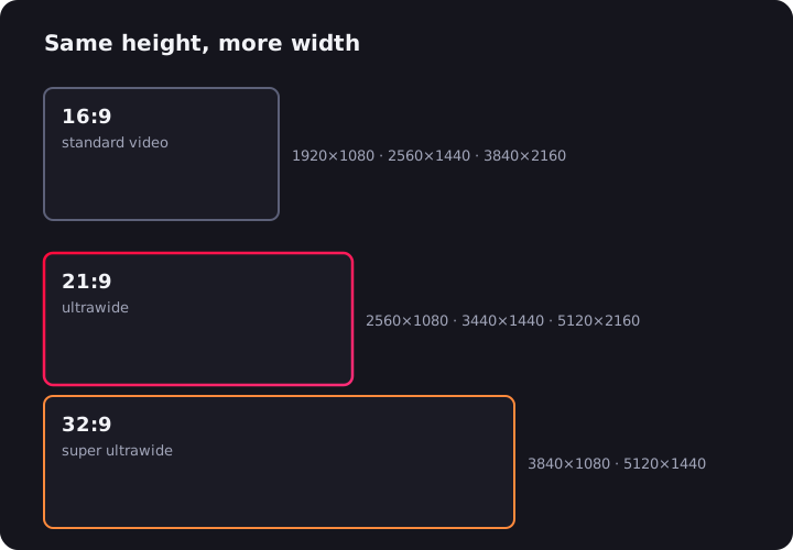
| 16:9 | 1.78 | The HD standard: TVs, monitors, YouTube, consoles | 1280×720, 1920×1080, 2560×1440, 3840×2160 |
| 18:9 (2:1) | 2.00 | Early tall-screen phones, some Netflix shows | 2160×1080, 2880×1440 |
| 19.5:9 | 2.17 | Modern iPhones and most Android flagships | 2436×1125, 2556×1179 |
| 21:9 | ~2.37 | Ultrawide monitors | 2560×1080, 3440×1440, 5120×2160 |
| 32:9 | 3.56 | Super ultrawide monitors | 3840×1080, 5120×1440 |
| 1.85:1 | 1.85 | "Flat" cinema — comedies, dramas, most A24 films | 1998×1080 (cinema DCP) |
| 2.39:1 | 2.39 | "Scope" cinema — blockbusters, epics | 2048×858 (cinema DCP) |
| 9:16 | 0.56 | Vertical video: TikTok, Reels, YouTube Shorts | 1080×1920 |
A few things jump out of that table. Film ratios are traditionally written against 1 (1.85:1, 2.39:1) while screen ratios use whole numbers (16:9) — same idea, different notation. 9:16 is just 16:9 turned sideways. And "21:9" is a slight lie: real ultrawide panels are 64:27 or 43:18, a touch wider — the 21:9 explainer unpacks that marketing rounding.
The Quick Answers
What aspect ratio is 1920×1080? 16:9. So are 1280×720, 2560×1440 and 3840×2160 (4K) — same shape, more pixels.
What aspect ratio is 3440×1440? Exactly 43:18, which works out to about 21.5:9 — sold and labeled as 21:9. It's the standard resolution of 34-inch ultrawide monitors, and its 2.39:1 shape matches widescreen cinema almost perfectly.
What aspect ratio is my phone? Almost certainly between 19.5:9 and 20:9 — tall and narrow in your hand, very wide in landscape.
How to Calculate an Aspect Ratio
Divide width by height and you have the decimal form: 1920 ÷ 1080 = 1.78, so any resolution that divides to 1.78 is 16:9.
To get the clean two-number form, divide both sides by their greatest common divisor (GCD) — the largest number that fits evenly into both. Worked example with 1920×1080:
- Find the GCD of 1920 and 1080. Using Euclid's method: 1920 ÷ 1080 leaves 840; 1080 ÷ 840 leaves 240; 840 ÷ 240 leaves 120; 240 ÷ 120 leaves 0. The GCD is 120.
- Divide both numbers by it: 1920 ÷ 120 = 16, and 1080 ÷ 120 = 9.
- Result: 1920×1080 is 16:9.
Try it on 3440×1440: the GCD is 160, giving 21.5:9 — er, 43:18. That's why marketing rounds it to 21:9; "43:18" doesn't fit on a box. The lazy shortcut works too: any calculator, width ÷ height, then compare the decimal against the table above.
Screens vs Film vs Phones vs Social: Why So Many Ratios?
Each world converged on the shape that suits how it's actually used.
Computer screens and TVs settled on 16:9 in the 2000s as the compromise that handles broadcast TV, DVDs and desktop work acceptably. It's the default for a reason: nearly all web video is produced for it, and YouTube's entire player is built around it. Monitors kept a few dissenters — 16:10 survives on laptops because that extra sliver of height fits more code and spreadsheet rows, and 3:2 returned on Surface devices for the same reason, taken further.
Cinema went wide on purpose. When TV threatened theaters in the 1950s, Hollywood answered with widescreen formats television couldn't match — CinemaScope and its descendants. Today two standards remain: 1.85:1 "flat" and 2.39:1 "scope." Directors pick scope for spectacle — landscapes, two-shots, scale. That's also the ancestry of the ultrawide monitor: a 21:9 panel is scope cinema's shape on a desk.
Phones grew tall. Phones were 16:9 for years; then bezels shrank and screens stretched to 18:9, 19.5:9, 20:9. In your hand that's not "wide," it's tall — better for scrolling feeds, and closer to the shape of your grip. Rotate one and you're holding a small scope cinema screen.
Social video went vertical. TikTok, Reels and Shorts standardized 9:16 because phones are held upright and full-screen video wins attention. It's the first mass video format in history designed to be taller than it is wide.
Photography holds at 3:2 and 4:3 — legacies of 35mm film and medium-format sensors respectively. And 1:1 square? A crop that ducks the whole question, which is exactly why early Instagram used it: every photo, portrait or landscape, fit the same grid.
What Happens When Ratios Don't Match
The trouble starts when content of one shape meets a screen of another — which, given the table above, is most of the time. A player or TV has three options, and only shows you one:
- Letterbox — the content is wider than the screen, so it's shrunk to fit the width, leaving horizontal black bars above and below. A 2.39:1 movie on a 16:9 TV loses about a quarter of the screen to bars.
- Pillarbox — the content is narrower than the screen, so vertical bars flank it. A 16:9 YouTube video on a 21:9 ultrawide, or a 4:3 classic on a modern TV.
- Windowbox — both at once: bars on all four sides. Happens when letterboxing is baked into the video file (a scope movie inside a 16:9 stream) and the screen then pillarboxes that file. Common — and maddening — on ultrawide monitors.
The alternatives are cropping (fill the screen, lose the edges) and stretching (fill the screen, distort the picture). No option is free; bars just happen to be the default because they're the only one that shows the full frame undistorted. The full story of who chooses what — and when the bars are actually removable — lives in why movies have black bars.
On ultrawide monitors the mismatch is a daily event, since nearly all web video ships in 16:9. That specific case has a clean fix: the free UltraWide Video extension for Chrome and Edge zooms or stretches any web video to your panel's exact ratio, with presets from 16:9 to 32:9.
Can You Change an Aspect Ratio?
Sort of — but every method pays a price, and it helps to know which one you're paying:
- Cropping cuts the image to the new shape. A 16:9 video cropped to 21:9 loses a strip from the top and bottom. When the crop only removes baked-in black bars, it's free; when it removes picture, someone at the edge of frame vanishes.
- Stretching distorts the image to fit — circles become ovals, faces widen. Sounds terrible, is sometimes fine: on casual content, a mild stretch is surprisingly easy to stop noticing.
- Padding adds bars to reach the new shape without touching the image. This is what players do automatically, and doing it manually (baking bars into a file) is almost always a mistake — the bars become permanent pixels.
Editors change ratios at export time; viewers change them at playback time with player zoom controls or, in a browser, an extension. What you can't do is conjure picture that was never filmed — a 16:9 camera recorded a 16:9 world, and everything beyond its edges is gone.
Aspect Ratio vs Resolution: Not the Same Thing
Worth keeping straight, because spec sheets blur them: resolution is how many pixels (1920×1080), aspect ratio is their proportion (16:9). One ratio spans many resolutions — 16:9 covers everything from 720p to 8K — and knowing the ratio tells you the shape, not the sharpness. For how resolution, size and pixel density interact on wide screens, see the ultrawide resolution guide.
The Takeaway
Aspect ratio is the shape of the picture: width against height, size irrelevant. Four numbers cover most of modern life — 16:9 for screens and web video, ~19.5:9 for the phone in your pocket, 2.39:1 for the movies, 9:16 for the feed. When shapes match, pictures fill screens; when they don't, you get bars, crops or stretching. Learn to read the ratio and every black bar you'll ever see becomes predictable — and, on the right screen with the right software, removable.

Watching on an ultrawide monitor?
UltraWide Video removes black bars from YouTube, Netflix, Prime Video and any other site — zoom or stretch any video to fill your 21:9 or 32:9 screen.